6. Plotting
Generalistic plots for data analysis.
6.1. Boxplots
A variety of boxplots for analysis of point data.
6.1.1. Boxplots
- resourcegeo.plots.boxplots.data_by_category(data, var, catcol, tmin=None, use_all=True)
Convert df with category to list of arrays vals + labels.
Return: df_values (list[np.array]): array-values for each category df_labels (list[str]) : Categorical labels
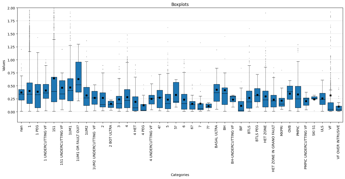
- resourcegeo.plots.boxplots.boxplot_by_category(data, var, catcol, cats=None, tmin=None, ylabel=None, xlabel=None, title=None, flname=None, markersize_flier=2, markersize_mean=4, widths=None, figsize=None, ylim=None, stats=True, stats_ycoord=None, use_all=True, yscale='linear')
Univariate. Boxplots by category. Optionally add number and unweighted mean to the plot.
- Parameters:
data (pd.DataFrame) – df with values and a category column
var (str) – column name for variable
catcol (str) – column name for category column
cats (optional) – Categories to consider from catcol
xlabel (str, optional) – x-label
ylabel (str, optional) – y-label
figsize (tuple,optional) – figsize
flname (str, optional) – path to save file if not None
stats (bool,optional) – Show number and unweighted mean for each box plot
yscale (str, optional) – y-axis scale
stats_ycoord (float, optional) – bottom coordinate to add the stats (count and mean). The mean is unweighted.
tmin (float, optional) – Minumum var value to filter out values
use_all (bool, optional) – If False, plot boxplots only for categories with >0 number of data. If True, it shows all boxplots. If tmin is not None, then tmin is applied before use_all.
Examples:
import resourcegeo as rs
df = rs.BaseData('assay_geo').data
_ = rs.boxplot_by_category(data = df,var = 'CUpc',catcol = 'UNIT',
        tmin=0, markersize_flier=0.5,widths=0.7,markersize_mean=4,
        ylim=(-0.2,2), stats_ycoord=-0.15, figsize=(17,6),stats=False, use_all=False)
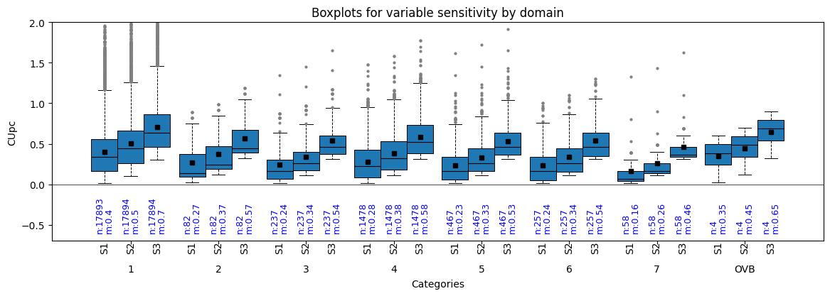
- resourcegeo.plots.boxplots.boxplot_by_category_sensitivity(dfs, var, catcol, yscale='linear', markersize_flier=2, markersize_mean=4, flname=None, figsize=None, title=None, xlabel=None, ylabel=None, bulkstats=True, coverage=0.75, stats_ycoord=0, ylim=None)
Univariate. Grouped boxplots by categories. It can be used to analyze sensitivity results.
- Parameters:
dfs (list[pd.DataFrame]) – list of DataFrame(s)
var (str) – shared variable column-name in all df in dfs
catcol (str) – shared category column in all df in dfs
title (str, optional) – title of the graph
xlabel (str, optional) – x-label
ylabel (str, optional) – y-label
flname (str., optional) – path to save file if not None
figsize (tuple, optional) – figsize
bulkstats (bool, optional) – show number and unweighted mean
ylim (tuple, optional) – y-axis coordinate limits. If bulkstats is True, you may need to use a lower y-minimum coordinate.
stats_ycoord (float) – bottom coordinate to add the stats (count and mean). The mean is unweighted.
coverage (float, optional) – width of boxes expresed as fraction from 0 to 1.
Examples:
import resourcegeo as rs
df = rs.BaseData('assay_geo').data
df2 = df.loc[df['UNIT'].isin([f'{i}' for i in range(1,9)]  + ['OVB'])].copy()
df3 = df2.copy()
df3['CUpc'] = df3['CUpc'] +0.1
df4 = df2.copy()
df4['CUpc'] = df3['CUpc'] +0.2
dfs = [df2,df3,df4]
rs.boxplot_by_category_sensitivity(dfs,'CUpc','UNIT',figsize=(14,4),
        coverage=0.9,ylim=(-0.7,2), bulkstats=True,stats_ycoord=-0.6)
6.2. Bar Charts
Bar Charts.
6.2.1. Drilling
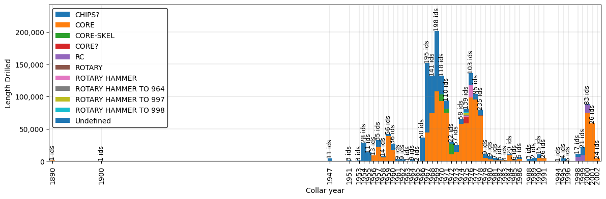
- resourcegeo.plots.drilling.drilling_by_year(df, var, cat, cat2=None, xlabel=None, ylabel=None, title=None, flname=None, figsize=(14, 4), cat2_colors=None, legend_loc=None, width=1)
- Generates a stacked bar plot by based on a continuous variable
and two categorical columns.
- Parameters:
df (pd.DataFrame) – df with continuous variable and two categorical columns
var (float) – Continuous variable to summarize sums
cat (str) – Column name for categorical that contains a sequence of integers to use in the bar chart. e.g. years
cat2 (str) – Column name for categorical values to be stacked
xlabel (str,optional) – x-axis label
ylabel (str,optional) – y-axis label
title (str,optional) – title for the plot
flname (str,optional) – path to save image
figsize (tuple) – figure size
cat2_colors (dict) – dictionary for user defined colors.
legend_loc (int) – position of the legend
width (float) – with of the bars in the bar chart
Examples:
import resourcegeo as rs
df = rs.BaseData('collar').data
drill_type= 'drilltype'
df.loc[df[drill_type].isna(),drill_type]= 'Undefined'
rs.drilling_by_year(df,var='length',cat='year',cat2=drill_type,
   xlabel='Collar year',ylabel='Length Drilled')
6.3. Scatters
Scatter plots.
6.3.1. Resource Model
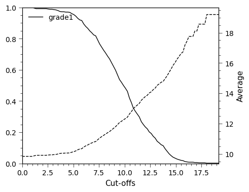
- resourcegeo.plots.tongrad.tonnage_grade_curve(dfs, var_col, cutoffs=None, weight_col=None, as_fraction=True, ylim1=None, ylim2=None, xlim=None, title=None, flname=None, xlabel=None, ylabel=None, ylabel2=None, fontsize=11, lw=1, figsize=(5, 4))
Generate tonnage-grade curve for one or multiple dfs, for multiple variables within each df.
- Parameters:
dfs (df or list[df]) – Data with a at least one column of values
var_col (str or list[list[str]]) – column-name(s) of variables in a df
cutoffs (list[float],optional) – cut-offs values. If None, 100 cutoffs between min-max values are chosen
weight_col (str,optional) – column-name if all dfs with values to weight the grade values. WARINING: All df’s must have the same weight_col name.
as_fraction (bool, optional) – If True, it shows tonnage axis as 0-1 fraction. If False, shows the sum of the weights.
ylim1 (tuple) – limit values for main y-axis (weight sum)
ylim2 (tuple) – limit values for secondary y_axis (average grades above cutoff)
xlim (tuple) – limit values for x-axis (cutoffs)
title (str) – plot title
flanme (str) – path to store plot. It does not create folders
fontsize (float) – overall font size
lw (float) – line width for GT curves
figsize (tuple) – figsize
- Returns:
None
Examples:
import resourcegeo as rs
bm = rs.BaseData('bm').data
rs.tonnage_grade_curve(bm, var_col='grade1')
6.3.2. Distributions
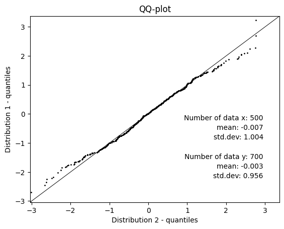
- resourcegeo.plots.qqplot.qq_plot(d1, d2, percentiles=None, ms=1, xlim=None, ylim=None, flname=None, ylabel=None, title=None, xlabel=None, figsize=None, fontdict=None)
QQ-plot with two given distributions. Lengths of the distributions may be different. Alternatively add percentiles and summary stats.
- Parameters:
d1 (np.array or list[float]) – distribution in x-axis
d2 (np.array or list[float]) – distribution in y-axis
percentiles (list[float]) – percentiles from 0-100 included
ms (float) – marker size
xlim (tuple[float]) – x-axis limits
ylim (tuple[float]) – y-axis limits
flname (str) – path to save plot
figsize (tuple(float)) – figure size
Examples:
import resourcegeo as rs
import numpy as np
rs.qq_plot(np.random.randn(500),np.random.randn(700))
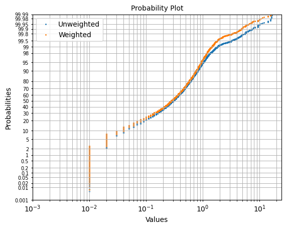
- resourcegeo.plots.probability_plot.probability_plot(data, var, weights=None, figsize=None, xscale='log', fontsize=10, s=1, ax=None, label=None, color=None, xlim=None, title=None, xlabel=None, ylabel=None)
Probability plot of a univariate distribution.
- Parameters:
data (pd.DataFrame) – DataFrame with values
var (str) – variable column-name in data
weights (str,optional) – column-name for weights to use
figsize (tuple) – Figure size
xscale (str, optional) – x-axis scale, it can be ‘log’ or ‘linear’
title (str,optional) – title
ylabel (str,optional) – y-axis label
xlabel (str,optional) – x-axis label
Examples:
import resourcegeo as rs
df = rs.BaseData('assay_geo').data
fig ,ax = plt.subplots(1,1)
_=rs.probability_plot(df,var='CUpc',ax=ax,label='Unweighted')
_=rs.probability_plot(df,var='CUpc',weights='ai',ax=ax,label='Weighted')
6.4. Sensitivity
Sensitivity plots.
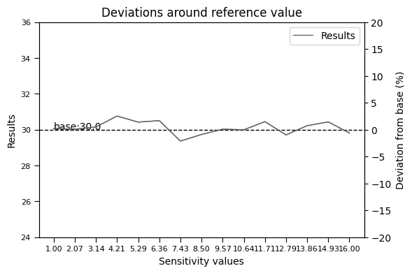
- resourcegeo.plots.deviation.deviation_plot(x, y, base, flname=None, title=None, y1_label=None, y2_label=None, xlabel=None, hline_label='base', dev_ylim=0.2)
Plot deviations with respect a base value after performing a sensitivity analysis.
- Parameters:
x (list[float]) – x values of the sensitivities
y (list[float]) – results from the multiple x-values
base (float) – Reference value around where deviation is calculated.
dev_ylim (float) – fraction of the base to use as +/- in (right) y-axis
xlabel (str) – x-axis label
y1_label (str) – Left y-axis of sensitivity results
y2_label (str) – Right y-axis for percentages of deviation from base value
title (str,optional) – title of the graph
flname (str,optional) – path to save figure
- Returns:
None
Examples:
import resourcegeo as rs
import random
import numpy as np
n, ref = 15, 30
a = np.linspace(1,n+1,n)
s = np.random.normal(0, 0.5, n)
b = [ref+j for j in s]
rs.plots.deviation.deviation_plot(a,b,ref)