XRF systems—whether portable units or CoreScan‑based platforms—have reshaped how geologists acquire geochemical information. They deliver rapid, high‑resolution, multi‑element datasets directly from drill core or outcrop, producing far more geochemical detail than traditional assays alone. Interpreting these dense datasets remains challenging because elements co‑vary, mineralogical associations overlap, and nonlinear relationships are often obscured by noise. Scatterplots collapse into dense point clouds, and black‑box machine‑learning models may predict well but provide little geological insight.
Generalized Additive Models (GAMs) offer a way forward because they combine nonlinear flexibility with the interpretability needed to understand mineral systems. A GAM can take XRF channels together with assay data and model how each element influences ore grade while simultaneously accounting for the effects of all other elements. This turns multi‑element geochemistry into a set of clear, isolated relationships and gives exploration and resource geologists a way to extract geological meaning—not just numerical predictions—from complex datasets.
Ore prediction is suitable for GAMs The idea uses XRF element channels as predictors, and the assay grades as target. GAMs provide a smooth, nonlinear function for each element, showing how peak elements xrf channels influence grade while holding all other elements constant. This is crucial in geochemistry, where Fe, S, As, K, Ca, and many others rise and fall together due to mineralogy, alteration, or lithology. A GAM smooth shows a controlled statistical relationship: the isolated effect of one element on the target grade. This is a valuable level of inference geologists require when interpreting multi‑element geochemistry.
What GAMs reveal that scatterplots cannot Scatterplots show raw data, but raw data is messy. Noise, multicollinearity, and overlapping geochemical processes make it difficult to see structure. GAMs separate these effects and expose the underlying relationships. Nonlinear enrichment patterns become much easier to interpret: Cu may rise with Fe until reaching a magnetite‑rich threshold where the relationship levels off. Sulphide associations stand out clearly when S shows a strong positive effect on Cu, reflecting the influence of chalcopyrite or related minerals. Halo elements such as As often peak before Cu, outlining zoning patterns around mineralized centers. Dilution effects emerge when elements like Ca or Mg consistently pull predicted grades downward, marking carbonate or mafic overprints. Thresholds, plateaus, and inflection points appear naturally in the smooth curves, revealing subtle geochemical transitions that are hard to see in raw scatterplots. Interactions—such as Fe × S—highlight mineralogical controls that depend on multiple elements acting together. Taken together, these patterns read like geological processes expressed through statistical structure.
Include multiple element peaks from XRF to avoid the risks of omitting confounders and distorting relationships. GAMs are designed to handle many predictors, even when they are correlated. The model can isolate the true partial effect of each element. This produces curves that reflect geochemical controls rather than raw correlations. This approach aligns with established statistical literature on GAMs and with environmental geochemistry studies that use GAMs to interpret chemical gradients. It also fits the direction of modern mineral exploration research, which emphasizes interpretable machine learning.
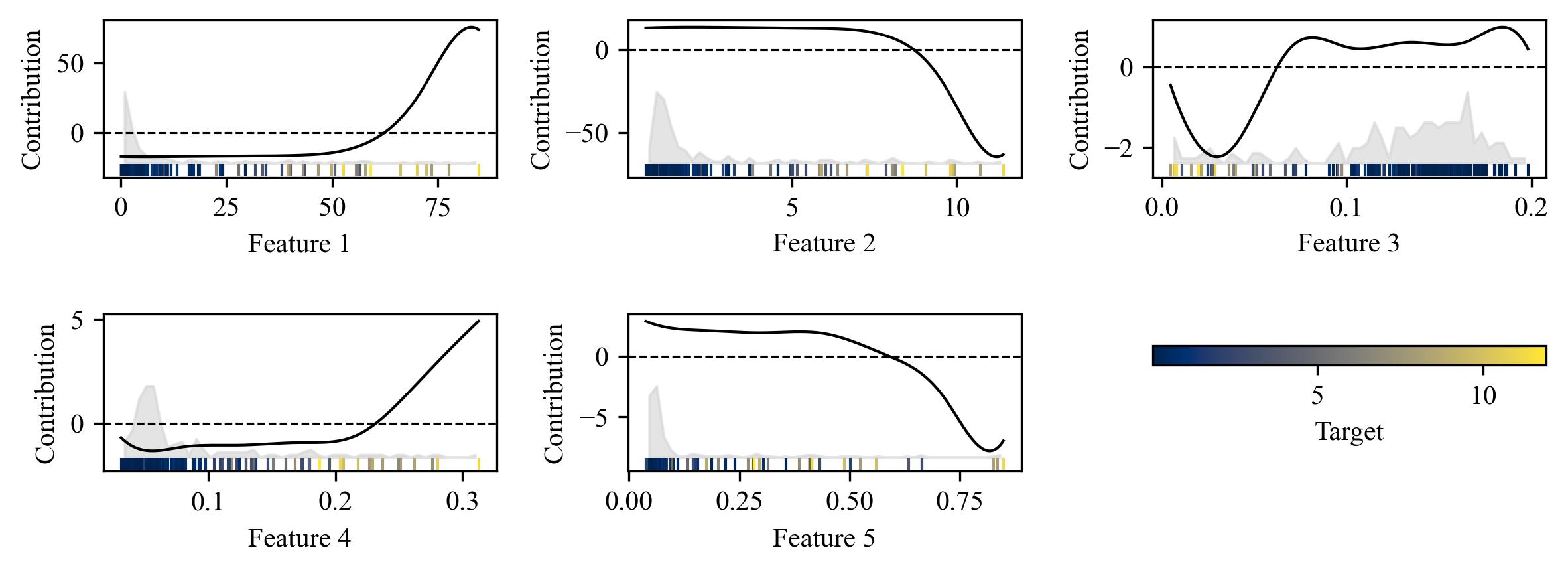
The partial‑effect plots generated from a generalized additive model (GAM) provide a detailed view of how each predictor contributes to the model’s output while holding other variables constant. By isolating the smooth function associated with each feature, the visualization makes it possible to see whether the relationship is linear, monotonic, nonlinear, or exhibits threshold effects. In your plots, the centered smooth functions highlight deviations from the mean contribution, allowing you to focus on the shape of the effect rather than its absolute magnitude. The overlaid histograms and rug‑like scatter markers add essential context: they show where the data are concentrated, where the model is extrapolating, and how the target variable is distributed across the feature range. This combination of smooth effects and empirical distributions helps identify whether apparent patterns are well‑supported by data or driven by sparse regions.
Despite their interpretability, GAMs have important limitations. They assume additivity, meaning each feature contributes independently unless explicit interaction terms are included. Real‑world systems often exhibit complex interactions that a purely additive model cannot capture. Smoothness penalties, while useful for preventing overfitting, can also oversimplify relationships, masking sharp transitions or local irregularities. GAMs also struggle when predictors are highly correlated, because the model may arbitrarily assign shared variance to one feature’s smooth term, distorting interpretability. Additionally, spline‑based models can behave unpredictably near boundaries, especially when data are sparse, leading to misleading partial effects.
Visualization plays a crucial role in diagnosing these limitations. By examining the smooth curves alongside the feature distributions, you can detect over‑smoothing, boundary artifacts, or implausible shapes. The color‑coded target values help reveal whether the model’s learned structure aligns with the underlying data patterns. Ultimately, these plots serve as a diagnostic tool, guiding model refinement, feature engineering, and decisions about whether interactions or alternative modeling approaches are needed.